Led the innovative renovation of one of HK’s top universities
CompanyCUHK
Education & Arts
industryRoleDesign Lead
timeline6 months

summaryThe faculty of Arts CUHK (Chinese University of Hong Kong) is the intellectual home for many world-renowned scholars, especially in the study of Chinese thought and culture.
Initially orange and purple, the team submitted the design with a blue and yellow colour palette. It was a safe business decision. As it turned out, a bold and bright palette was exactly what the Dean was looking for.
Challenges
-
01
The site’s information architecture did not reflect the goals of the website and the Faculty of Arts. It was too informative with no clear direction.
-
02
The site traffic was underwhelming. Students and professors were not engaged nor encouraged to further explore the site.
-
03
The lack of visual appeal on all fronts, from typography to the overarching theme did not speak well for the department.
UX Discovery: Strategy Blueprint
As part of her training, I had our Junior Designer create a strategy blueprint. She was new to User Experience Design as well as handling an entire project. I went through this exercise with her a few rounds until our objectives were met.


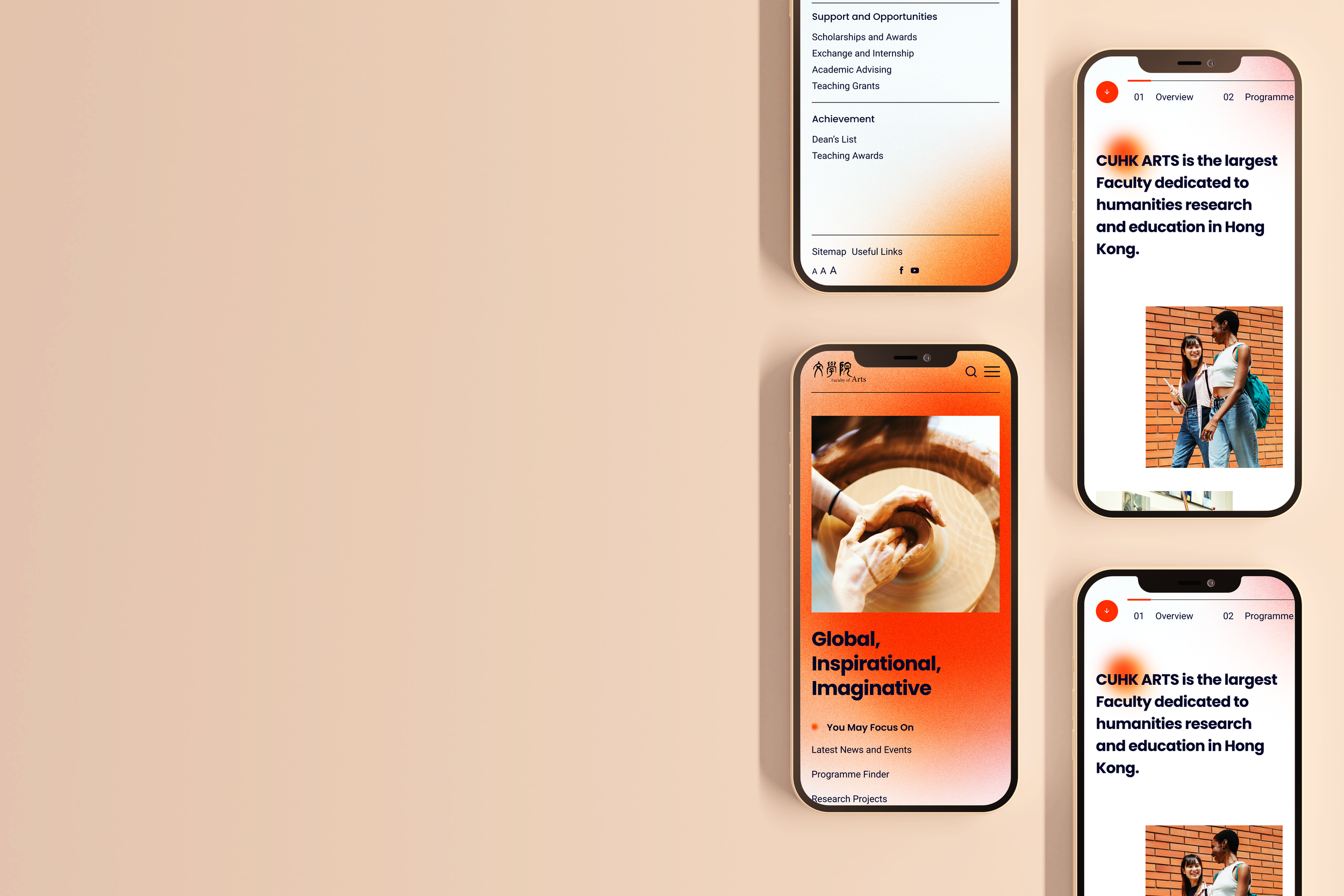
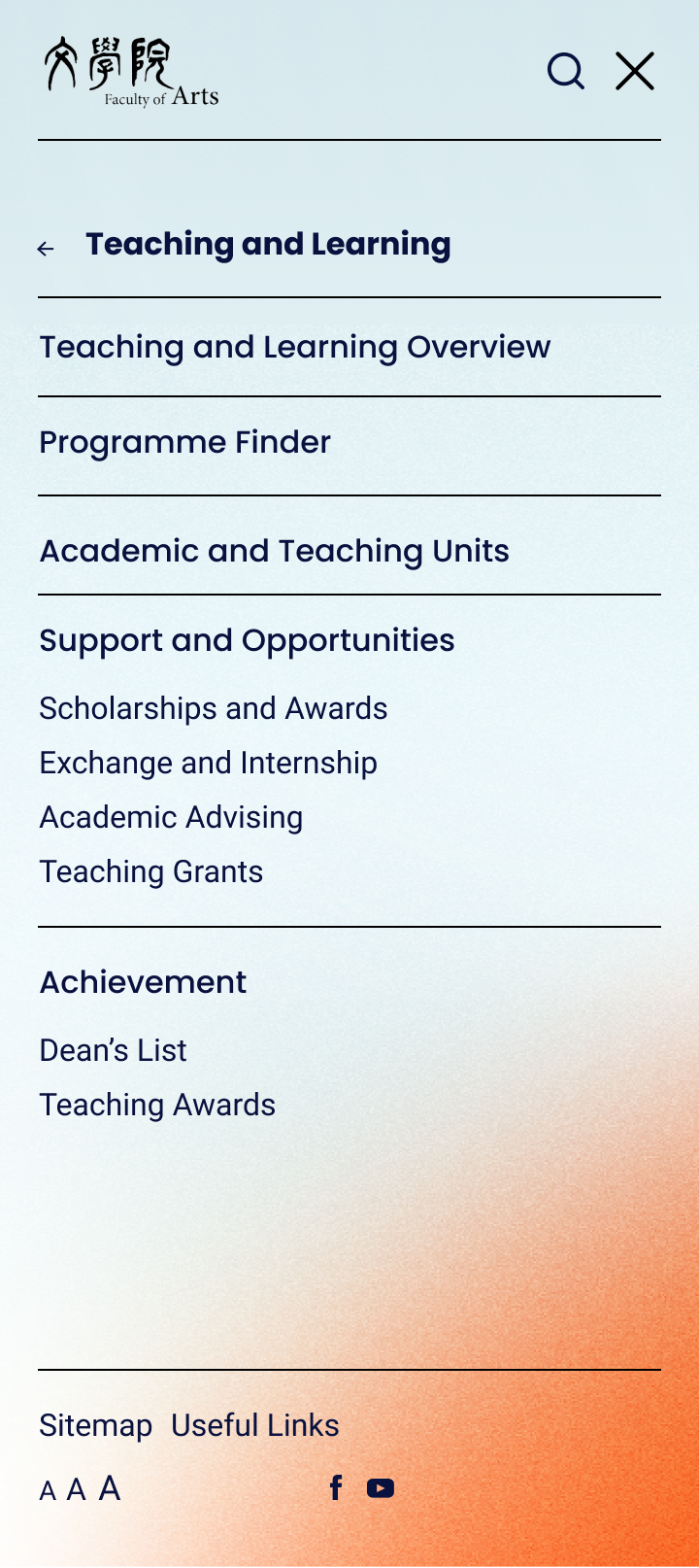
A behemoth of information architecture, strategically navigable with a thumb.
The main challenge was to strategically choose or create each UI that best delivered the content without sacrificing the experience of the user, then the content itself.
Design Direction & User Interface
The client had a strong set of attributes that the site needed to portray. I worked with my Junior Designer in defining how the website can not only reflect, but look, speak and feel of these attributes.
Global and Innovative, Diversity
Despite the Faculty being heavily rooted in history and tradition, the site is designed to visually and structurally compete on an international standard.
Humanistic
From animation to graphics, we used ones that are organic and true in order to portray the rational being.
Depth
Elements, such as graphics, iconography and typography, have interesting qualities that require a level or two to unfold its true meaning.

testimonial"I experienced first hand how she creates space for others’ voices, builds alignment in complex situations, and brings a calm confidence that makes people want to follow her lead. She's highly sought after as a collaborator because she makes every project sharper, every discussion more constructive, and every team stronger."